
Most travellers come home with a camera roll full of walls. A whitewashed lane in Oia. A cobalt doorway in Marrakech. A row of pink facades in Jaipur glowing in the late afternoon. The photos get scrolled through once or twice, and the trip slowly fades into the same pale rooms it started from.
It does not have to end that way. Colour is one of the few souvenirs that changes how a home feels every day, and travel-inspired interior painting is easier to get right than most people expect, as long as you respect the gap between Mediterranean sunshine and a February afternoon in Canada. For anyone who escapes the cold each winter, there is a practical bonus too. The week or two you spend away is the ideal window for interior painting, because the moved furniture, drop cloths and paint smell all happen while you are somewhere warmer.
This guide covers both halves of that idea: how to take a palette from a place you loved and make it work at home, and how to time the job so you come back to it finished.
Why the Colour You Loved Abroad Looks Different at Home
Paint does not travel well. The blue that looked electric on a sunlit wall in Morocco can turn heavy and dull in a north-facing living room in Ottawa. That is not a flaw in the paint. It is the light.
In the Mediterranean, North Africa, or central Mexico, strong sun hits walls for much of the day and bounces off pale stone, sand, and water. Through a Canadian winter, daylight is shorter, lower and cooler, and for hours each evening a room is lit by lamps. Scale matters as well. Colour intensifies as it covers more surface, so a shade that charmed you on a shutter can feel overwhelming on four walls.
One number on most paint chips helps. Light reflectance value, or LRV, measures how much light a colour reflects on a scale from 0, which is black, to 100, which is pure white. If the room you have in mind is dim, choose a higher-LRV version of your destination colour. If it is bright and south-facing, you can afford to go darker.
Five Destinations and the Palettes Worth Borrowing
The trick is to borrow the idea behind a place, not only the shade.
Santorini and the Cyclades: white that works for a living
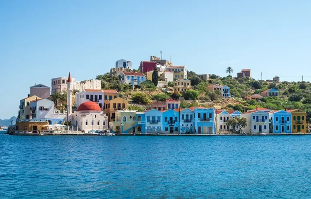
Islanders in the Cyclades traditionally coated their stone houses in lime-based whitewash because it was inexpensive, reflected the fierce summer sun and helped keep interiors cool. Doors, shutters and church domes were picked out in blue.
The lesson is that white is not one colour. A stark, cool white that dazzles in Aegean light can look grey under a Canadian winter sky, while whites with a little warmth in the base hold up far better. Use a warm white across walls and ceilings, then add a single strong blue somewhere small: a front door, a bathroom vanity, a headboard wall. For the chalky island texture, limewash paint is an option, though it suits some surfaces far better than others.
Marrakech: one brave blue
In 1923, the French painter Jacques Majorelle bought land in Marrakech and spent years turning it into a garden, painting its walls, fountains and studio in an intense cobalt drawn from the tiles and Berber textiles he saw around Morocco. The shade now carries his name.
Majorelle blue works because it is contained, set against deep green planting and plenty of shade. Indoors, give it a defined space: a powder room, the back of a bookcase or the inside of a front door. Pair it with warm wood, terracotta and brass, and it reads as joyful instead of cold.
Jaipur: the colour of welcome
Jaipur’s old city earned the name Pink City in 1876, when Maharaja Sawai Ram Singh II had its buildings painted ahead of a visit from the Prince of Wales. Pink was associated with hospitality, and the walled city has been kept that colour ever since.
The pink is not candy floss. It is closer to a dusty terracotta, and that earthiness is why it translates so well. Muted, mineral pinks read warm and grown-up in a Canadian home and flatter both daylight and lamplight. Given the story, an entryway or dining room is the natural place for it.
Mexico City: Barragán’s walls
Luis Barragán, the Mexican architect who won the Pritzker Prize in 1980, treated colour as a building material. At Cuadra San Cristóbal, the equestrian estate he completed in 1968, vast planes of pink and mauve frame water and sky.
The idea worth borrowing is that one bold colour on one large plane can do more than a scattering of accents. It suits modern condos with plain drywall especially well. Choose the wall at the end of a hallway or behind a dining table, paint it in one confident colour, and keep everything around it pale.
Tuscany: earth you can live with
Raw sienna, the warm yellow-brown pigment in paint boxes everywhere, takes its name from the Tuscan city of Siena. Ochres, umbers and sun-faded plaster tones may be the easiest destination palette to bring home, because warm earth tones flatter low winter light instead of fighting it. They suit kitchens and dining rooms, pair naturally with wood floors, and forgive daily scuffs better than crisp pastels.
How Do I Choose Interior Paint Colours from Travel Photos?
Cameras adjust colour automatically, and screens vary, so a photo is a starting point, not a final reference.
- Start with the feeling. Ask what the colour was doing in the photo. A background, like Santorini’s white, or a single bright note, like a Marrakech door? That role tells you where it belongs at home.
- Get physical samples. Use the photo to find a colour family, then test large samples instead of trusting a small chip or a screen.
- Test in your own light. Look at swatches on two walls in the morning, late afternoon and under lamps at night, and live with them for a few days.
- Plan proportions. Designers often use a 60-30-10 guideline: a dominant colour, a secondary colour and an accent. Travel colours usually start as the 10 percent.
Getting the Finish Right for Interior Painting
Sheen changes how a colour looks almost as much as the colour itself. Matte suits ceilings and low-traffic rooms because it hides imperfections. Eggshell is the usual choice for living rooms and bedrooms. Satin earns its place in hallways and kitchens, and semi-gloss is traditional for trim, doors and bathrooms. Deep blues, terracottas and pinks often need an extra coat to reach full depth, which is worth raising early if you are leaning towards Majorelle over Mykonos.
The Traveller’s Advantage: Painting While You Are Away
The hardest part of repainting is usually living around it: furniture in the middle of rooms, bedrooms out of action, the smell of paint for days. Frequent travellers can avoid all of it by booking the work for the dates they are gone.
Is it safe to stay in the house while painting?
For most healthy adults, yes, particularly with modern water-based paints and a crew working room by room. Paint does release volatile organic compounds, or VOCs, as it dries, and guidance from the U.S. Environmental Protection Agency and Consumer Product Safety Commission recommends keeping windows open for two to three days after painting, weather permitting. Households with babies, pets or respiratory sensitivities often prefer to be elsewhere. In a Canadian winter, open windows are nobody’s idea of comfort either.
How long after painting can you sleep in the room?
Dry and cured are different things. Most water-based interior paints are dry to the touch within an hour or two, but full hardness takes much longer; Benjamin Moore’s Ben interior line lists a full cure of 14 days. Many painters suggest waiting at least a day or two before sleeping in a freshly painted, well-ventilated room. A trip of a week or more covers that comfortably.
What is the best time of year to paint the interior of a house?
Unlike exterior work, interior painting can happen in any season. Heated homes tend to have drier winter air, which helps water-based paint dry, and many painting companies have more room in their calendars once the exterior season ends. That lines up neatly with the season Canadians head south.
How long does it take to paint the interior of a house?
A single room is often a one or two-day job for a professional crew. A whole house typically runs from several working days to a couple of weeks, depending on size, repairs, ceilings, trim and the number of colours. Preparation often takes as long as the painting itself, so a two-week getaway covers most whole-home projects with drying time to spare.
Hiring Help, and What to Sort Before You Fly
Leaving a crew in an empty house takes trust. Look for a written scope listing every room, colour code, sheen and number of coats. Confirm liability insurance and, in Ontario, WSIB coverage, and read what past clients say. Colour advice is worth asking about when the inspiration is a holiday photo. In Toronto, for example, Home Painters Torontooffers colour consultations with its interior work, which can help turn a Jaipur pink into something that suits a Leslieville semi with north-facing windows.
Before you leave:
- Confirm every colour and sheen in writing, room by room.
- Arrange access and share alarm codes and any condo rules for trades.
- Pack away valuables and clear the walls of art and mirrors.
- Leave the heating at a normal setting, since most paint labels set a minimum application temperature.
- Agree on ventilation after the final coat, and ask for photo updates.
Coming Home to It
There is a particular pleasure in opening your front door after a long trip and finding the house changed. The dining room is the dusty pink of an evening in Jaipur. The powder room door is the colour of a Marrakech garden. The trip does not end at the airport; it carries on in the rooms you use every day.
It does not need to happen all at once. One wall or one confident door is enough to see how a destination colour lives in Canadian light. If you are in Toronto or the GTA and would rather spend the holiday on a beach than on a ladder, Home Painters Toronto is one team worth talking to before you book the flight.
The photos will still be on your phone. The difference is that now you get to live in one of them.