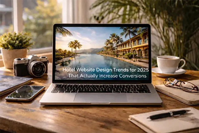
Hotel website trends are fun to look at, but “pretty” is not the goal. The goal is simple: help a traveler feel confident, find the right room fast, and book without friction.
If your site can do that, you win more direct bookings, even when guests are price checking on OTAs.
Here are the 2026 design trends that matter because they improve clarity, speed, and trust.
1) A booking path that is visible on every scroll
In 2026, the best hotel sites stop making people hunt for the next step.
That means:
- A clear primary CTA (Check availability, Book now, View rooms)
- A sticky booking bar on mobile
- A persistent way back to dates, rates, and room selection
This is not “more buttons.” It is one obvious path. Travelers should never wonder what to do next.
2) Rate clarity and fee transparency up front
Travelers are tired of surprises. If your pricing only becomes clear at the last step, you will get more drop offs.
Conversion friendly sites do a few things well:
- Show total price context early (at minimum, explain what is and is not included)
- Make policies easy to scan (cancellation, deposit, check in, check out)
- Use plain language for resort fees, parking, and extras
It sounds basic, but it builds trust fast. And trust is what turns browsing into booking.
3) Room pages that answer real questions, in the right order
A common hotel website problem is room pages that look beautiful but feel thin. Guests still have questions, so they bounce back to Google or the OTA.
A high converting room page usually follows this flow:
- What is this room, and who is it for? (one sentence)
- The top benefits (view, bed type, square footage, sleeper sofa, balcony)
- Photos that match the claims (not just vibe shots)
- Amenities grouped logically (sleep, bathroom, tech, accessibility)
- Policies and what to expect (fees, occupancy, check in details)
- A simple comparison to other room types
If your room pages feel like a confident salesperson, not a brochure, you will see the difference.
4) Speed as a design feature, not a tech chore
Speed is not only technical. It is a design decision.
In practice, speed wins come from:
- Fewer heavy sliders and auto playing video
- More intentional image use (hero image that loads fast, then supporting images later)
- Cleaner layouts that do not rely on giant scripts for basic animations
A fast site feels more premium. It also reduces booking friction, especially on mobile and hotel Wi-Fi.
5) Trust blocks that look native, not like badges from 2012
Travelers want proof, but they do not want clutter.
Modern trust design looks like:
- A short review snippet near the booking CTA
- A “Why book direct” section with real benefits (best rate, flexible policy, perks)
- Clear contact options (phone, email, chat) that feel human
If your trust signals feel bolted on, users ignore them. If they feel like part of the page, they work.
6) Accessibility baked into the experience
Accessibility is not a “nice to have.” It is part of good UX, and good UX converts.
Hotels can get quick wins by improving:
- Contrast and font sizes
- Keyboard navigation and focus states
- Form labels, date pickers, and error messages
- Alt text that describes what matters (room view, bed type, bathroom layout)
Better accessibility also tends to mean fewer usability issues for everyone.
7) Personalization that helps, without being creepy
Personalization is trending, but the best versions are subtle.
Examples that feel helpful:
- Remembering recently viewed rooms
- Sorting options that match common intent (family friendly, accessible rooms, quiet floors)
- Smart collections like “Best for couples” or “Best for business travel”
Keep it simple. If it feels like surveillance, it backfires.
8) Content that supports the booking decision
A traveler might love your property, then hesitate because they are unsure about the neighborhood, parking, or how far things are.
The best hotel sites add decision support content such as:
- “Getting here” with real directions and transport options
- Neighborhood guides with 5 to 10 specific recommendations
- Seasonal tips (weather, events, best rooms for the season)
This content also pulls in organic traffic, which helps your direct booking mix over time.
A quick, practical takeaway
If you only improve three things this quarter, do these:
- Make the booking CTA impossible to miss on mobile
- Improve room page clarity and comparison
- Fix pricing and policy transparency
And if you want a team to implement these changes quickly without losing the hotel’s brand feel, that’s exactly what seobusters.io focuses on: conversion first web design that still looks premium.


